To get to the Paddy Bedford show at the Museum of Contemporary Art and back should take only an hour or so. I left home just before nine o'clock and walked down a deserted Beamish Street, stopping only to buy a sausage roll at one of the Chinese bakeries along the strip. When I returned to Campsie Station it was already twelve o'clock and the street, naturally, was bustling with crowds of shoppers, as it always is on the weekend.
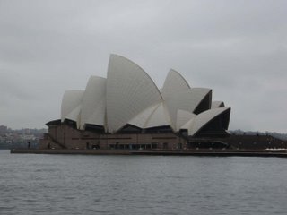
What happened to the time? I only spent twenty minutes at the exhibition, a retrospective housed on two floors of the museum. Arriving too early by half and hour, I stepped into a cafe on the Quay and ordered a coffee plus a sugar-covered roll filled with sweet ricotta and cinnamon. The rain was falling on the tourists and the guy emptying the rubbish bins along the footway. Pigeons flapped under the awning to scrounge. I snapped a picture of the Opera House, relishing the pale tones of the scene: white on grey.
The Paddy Bedford show was great, but nothing really grabbed my attention apart from a lemon-yellow composition for which there was, unfortunately, no postcard. I read about the Bedford retrospective yesterday and decided to visit to see if it was as good as Sebastian Smee said it was.
Bedford's work is mainly made up of few colours. The paintings can reliably be grouped into three categories. There are the ochre ones with mainly black designs. There are the multicoloured ones that resemble Mondrian (as both Smee and I, independently, pointed out). Then there are the black-and-white ones. In some ways, these last are the most dramatic.
But I'm still trying to decide if he's really as good as Smee says he is. After all, a retrospective at the MCA doesn't come to just anybody. Flicking through the fifty-dollar catalogue in the shop after leaving the hung rooms, I noted how prolific Bedford is. I just wonder how long it takes him to complete your average painting. They seem so simple.
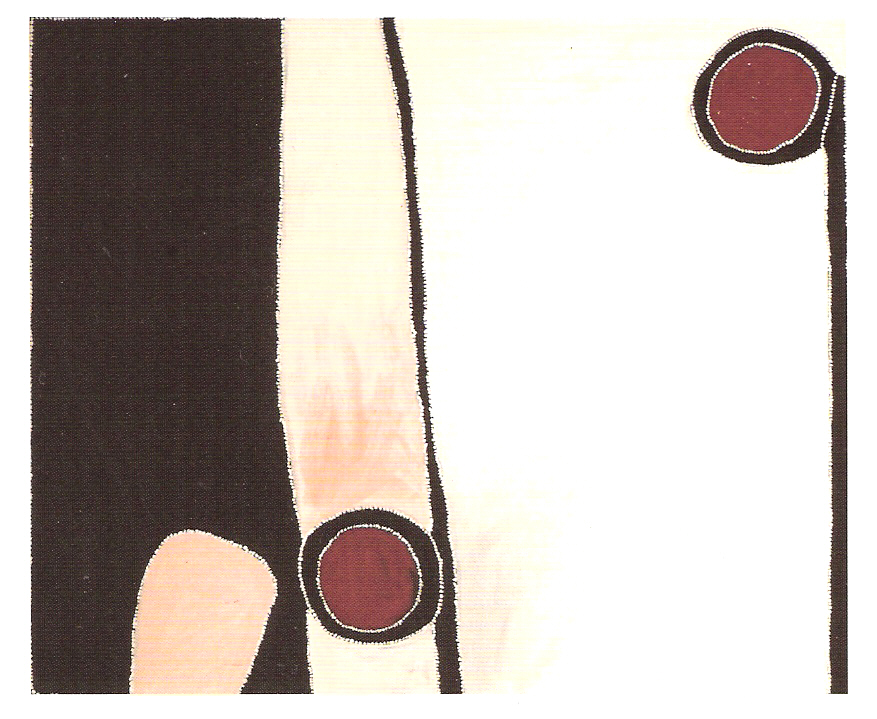
Arcs, polyps, arches, arachnid forms, things that look like lakes, heads, snakes, emus. All these shapes. And the black-and-white ones with their swathes of darkness and ribbons of white. Very dramatic and compelling. But the ochre ones sort of command attention, too. Here's one on a card I bought.

I guess the impressionistic contours of his work remind me most of all of Cy Twombly. There's something unfinished and contingent about it all.
After leaving the exhibition I headed up Pitt Street and popped into Dymocks. Then on to the big shopping precinct located between King and Market Streets, where Borders and Angus & Robertson beckoned. Finally, I spent fifteen minutes or so in Kinokuniya's. My purchases:
Bali: Paradise Lost?, Emma Tom (2006)
A Writer At War: Vassily Grossman with the Red Army 1941 - 1945, edited and translated by Antony Beevor and Luba Vinogradova (2005)
Music for Chameleons, Truman Capote (1975)
The Collection: Journalism, Reviews, Essays, Short Stories, Lectures, Peter Ackroyd (2001)
A Capote Reader, Truman Capote (1987)
I also picked up the latest issues of The New Yorker and The New York Review of Books. No newsagent around here sells either. I have checked them all out. But I did manage to purchase a premium-priced litre of milk at the newsagent on the way down Beamish Street.
What happened to the time? I only spent twenty minutes at the exhibition, a retrospective housed on two floors of the museum. Arriving too early by half and hour, I stepped into a cafe on the Quay and ordered a coffee plus a sugar-covered roll filled with sweet ricotta and cinnamon. The rain was falling on the tourists and the guy emptying the rubbish bins along the footway. Pigeons flapped under the awning to scrounge. I snapped a picture of the Opera House, relishing the pale tones of the scene: white on grey.

The Paddy Bedford show was great, but nothing really grabbed my attention apart from a lemon-yellow composition for which there was, unfortunately, no postcard. I read about the Bedford retrospective yesterday and decided to visit to see if it was as good as Sebastian Smee said it was.
Bedford's work is mainly made up of few colours. The paintings can reliably be grouped into three categories. There are the ochre ones with mainly black designs. There are the multicoloured ones that resemble Mondrian (as both Smee and I, independently, pointed out). Then there are the black-and-white ones. In some ways, these last are the most dramatic.
But I'm still trying to decide if he's really as good as Smee says he is. After all, a retrospective at the MCA doesn't come to just anybody. Flicking through the fifty-dollar catalogue in the shop after leaving the hung rooms, I noted how prolific Bedford is. I just wonder how long it takes him to complete your average painting. They seem so simple.
Arcs, polyps, arches, arachnid forms, things that look like lakes, heads, snakes, emus. All these shapes. And the black-and-white ones with their swathes of darkness and ribbons of white. Very dramatic and compelling. But the ochre ones sort of command attention, too. Here's one on a card I bought.
I guess the impressionistic contours of his work remind me most of all of Cy Twombly. There's something unfinished and contingent about it all.
After leaving the exhibition I headed up Pitt Street and popped into Dymocks. Then on to the big shopping precinct located between King and Market Streets, where Borders and Angus & Robertson beckoned. Finally, I spent fifteen minutes or so in Kinokuniya's. My purchases:
Bali: Paradise Lost?, Emma Tom (2006)
A Writer At War: Vassily Grossman with the Red Army 1941 - 1945, edited and translated by Antony Beevor and Luba Vinogradova (2005)
Music for Chameleons, Truman Capote (1975)
The Collection: Journalism, Reviews, Essays, Short Stories, Lectures, Peter Ackroyd (2001)
A Capote Reader, Truman Capote (1987)
I also picked up the latest issues of The New Yorker and The New York Review of Books. No newsagent around here sells either. I have checked them all out. But I did manage to purchase a premium-priced litre of milk at the newsagent on the way down Beamish Street.
1 comment:
I remember reading a review of that Emma Tom book that said it was really, really bad... will be interested to hear what you think.
Post a Comment