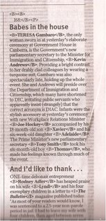
 The 'Strewth!' column in The Australian today has had a wardrobe malfunction... As you can see from the image shown here, the header image has gone walkabout and, in the body of the text, formatting tags are visible.
If you want to know what the header normally looks like go to the Web page of the broadsheet. The column appears about half-way down the page.
It's not often that a newspaper will so completely stuff things up, and I thought it was noteworthy. But the truth is that I'm on holidays, and have nothing better to do with my time than to nit-pick.
3 comments:
Dean you gotta get out more... happy holidays!
I gott find a way to stop this *%$#@^% spam from crowding out legit comments!
Hehe. I was once a production editor on a weekly business-to-business magazine who let slip the following headline in large 52 point typeface: "Headline needed here". The page was proofed by three people and no-one spotted it!!
Post a Comment