Pages

Monday, 27 March 2023

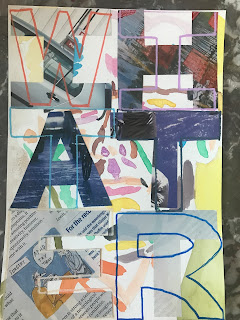
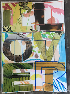
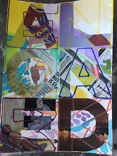
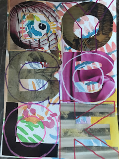
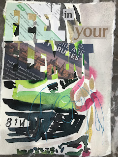
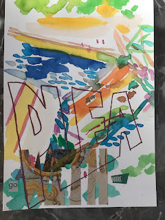
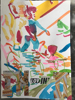
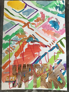
A distant ship on the horizon (the newscast)

You might remember if you’ve been following the progress of my art practice that I did a series called ‘Shipwreck’, it was back at the middle of last month (it seems like years have passed) and it contained renderings of ships mainly the Pasha Bulker that ran aground off Newcastle in 2008. 

More recently in fact last year there was the Portland Bay operated by a company called Pacific Basin (operating out of Hong Kong) which lost power at sea near Sydney. At the time I took photos of the newscasts the ship was still at sea and every day there were updates fed to viewers via the Nine channel as well as others, I don’t know I can’t remember exactly which station broadcast what it was so long ago and so many things have happened to me in the intervening months.

In fact in July I met Simon Kahn and we started the art group, so it has truly been a momentous year for me. Nevertheless I distinctly recall the ship and have therefore used it to talk about time’s passing in this new work ‘A distant ship on the horizon (the newscast)’ .


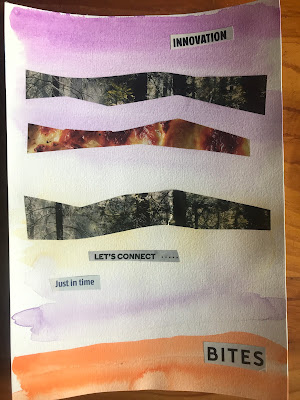
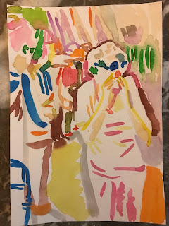
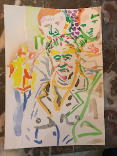
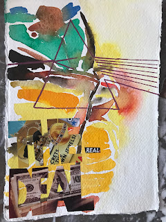
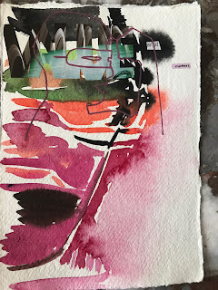
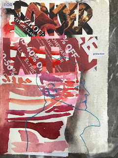
The above photo shows the necessary 4 panels laid out in the correct order. The following photos show the individual panels separately.


I’m tentatively happy with the overall effect but am welcome to ideas from other people. ‘A distant ship on the horizon (the newscast)’ of course references a popular song of my youth, in fact the song was on a concept album that all of my friends were listening to that had been put out by Pink Floyd in late 1979 titled ‘The Wall’. 

Looking back it was timely as the Berlin Wall came down a decade later but for us the idea of protest embodied in the songs had a closer relevance. The only thing I can think about now in relation to the songs is how poor the education system was (is?) in addressing our needs. The art group is a way for me to regain time (see first panel) but like looking through the smoke of a burning forest it’s hard to remember the reason why it was important to make art in the first place.

Settling on a 4-panel work like this is a new approach for me, previously these “double overlay” works have been standalones, and the reason for additional curiosity and application is the show planned for June. As I put together things to go in the show I see new opportunities for expression and this leads me to starting works. A major problem for me is insight however, as the more I struggle the harder it is to write coherently about the work, I wish someone else would come and take the job of talking about ‘A distant ship on the horizon (the newscast)’ away from me, relieve me of the burden of making sense, of promoting the work, of being a mouthpiece. The more I think about it the less I want to explain and clarify but by the same token writing has become such an intrinsic part of my life – writing a way to do art WHILE SEATED AT A DESK – that I also see no way to avoid speaking.

While seated at a desk. In a way Pink Floyd’s ‘The Wall’ is a reaction to the study (not to be confused with the studio), or at least I currently choose to see it that way. I choose that explanation for my interest in a ship in distress at sea. What is it about ships that attracts us so strongly? Is it the idea of another shore, or places to go to gain wealth, status, or experiences? Is it the danger that draws us, that challenges our jaded complacency: here, look, this is what adventure is like. When we sit down to watch the news, or, more likely, when we overhear a story on the news as we’re preparing dinner of helping the kids with some routine task, do we empathise with the people whose traumas are laid out for our entertainment? Do we feel comfortable, and forget about the niggling insecurities that lash us? Do we wish we were somewhere else? Do we reconcile ourselves with our domestic dramas?

Whatever it is about the news it’s not going away anytime soon in fact it looks more and more every week like an institution, complete and fixed in space, a point of reference we can all orient ourselves by as we journey through life.

Sunday, 19 March 2023

Going back to 'Social animals' series

I’d just done some “double overlay” paintings, in fact four of them (see last post) and decided to go back to November when I made the original “social animals” series. The reason for this move was that I didn’t have any new Japanese “kotowaza” to use but needed a break. The ‘Social animals’ paintings are easy to do and this time I’d be making sets deliberately, originally I made up the sets in the end with extra ‘Party animal’ paintings having made a bunch of the other ones. You’ll see (if it’s not clear what I’m talking about right now).


I had always wanted to make ‘Social animal’ paintings in red and blue, and now added yellow as well for variety. Perhaps in future I’ll just do red and blue alone or maybe red, white and blue. That’s the thing about painting it’s not just WHAT you draw of paint, it’s also the colours you use, or else the overall tone.

I chose brightness this time because red, blue and yellow is a happy combination. For the collage I used some old paramontage rejects photos that were still usable in this way but that I otherwise had no use for. I have a bunch of paramontages upstairs not being used that people can’t even see because the living room is on a different floor, but I haven’t made up my mind to cut them up yet. Maybe some of the less successful ones I’ll cannibalise in this way I haven’t made up my mind yet.

The photo paper these paramontages are printed on is very thick relative to ordinary magazine paper so it takes a while to get the collage to stick but I spend a good deal of effort making sure it does. Following the red-blue-yellow ‘Social animals’ set I’ve also started a maroon/purple set so will post those later on the blog. The reason I chose the maroon/purple colour scheme is that a friend recommended this for a “kotowaza” series and I got some positive feedback on the colours then.

Saturday, 18 March 2023

New collage series 2

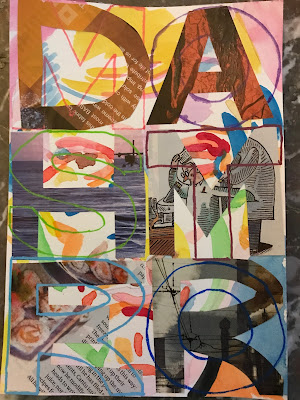
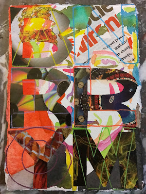
I started this “double overlay” collage series last week and you can see the post about it on the blog if you go to look in the menu, then I got caught up in “kotowaza” paintings again before coming back to it. I did these four paintings a couple of days ago and while I still have some reservations about this series, especially with regards to framing, I am pretty happy with how things are progressing.


It takes a while to plan a painting like this because you need to work out spacially where the underpainting is going to get cut off by the pasted letters. It’s like writing a sonnet where you need to work out how to make the rhymes match the sense, you start with the hard bit then let the rest of it take care of itself.

I made the Twitter pair first, one morning getting my paints and brush ready along with water, a cutting knife, and a sheet of paper towel. I use the cheap Officeworks paints mainly substituting Japanese watercolours occasionally. I don’t use paint from a tube for these paintings as I need a wide range of paints quickly and it takes too long to open the tube, squeeze a tiny bit out onto a takeaway-container lid, and put back the cap.


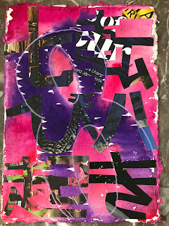
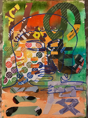
I did ‘Alone Denmark’ next then ‘Gobbledygook’ to round out the day’s work. I enjoy every part of the process with the exception of the underpainting in watercolour. The reason I don’t enjoy this part is because it’s permanent and the placement is critical making it a bit nerve-wracking, so for example you can see in ‘Alone Denmark’ I didn’t quite hit the mark and the subject’s eye is missing in the final assembly.

The Posca marks that are put over the top are also a bit nerve-wracking because of the care needed to make them clean and in place so I don’t completely enjoy this part of the process but the selection of colours like the collage part is a lot of fun. I always look forward to seeing what it will look like in the end.

Friday, 17 March 2023

New kotowaza paintings

I wonder if getting “kotowaza” (Japanese sayings) from my family is quite fair, if it’s just a way to get approval in advance for a piece. I’m not sure. All I know is that it makes sense to do paintings in this way, by getting other people involved. Perhaps this was my weakness all those years ago in that the reason I didn’t continue with art practice when I was a young man was because I needed approval.

Perhaps.

Nevertheless that’s who I am. I have another friend who helped with these paintings and her name is Basia, she helped by suggesting the colours. She said I should go outside my comfort zone and do green/blue and maroon/purple and that’s what I did.

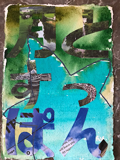
'Chalk and cheese' (the moon and a turtle).

'Loost a fly to catch a trout' (a loss leads to a benefit).

'An impossible task' (eye medicine from the second floor).

'Ups and downs' (fall down seven times get up eight).

This wasn't the order in which they were made it was 1, 2, 4, 3 but I started with the green/blue ones and then did the maroon/purple ones. If you have suggestions for the colours for the nexdt lot, let me know in the comments. I will try to get more "kotowaza" sayings from my family soon ...

Tuesday, 14 March 2023

Progress of collage

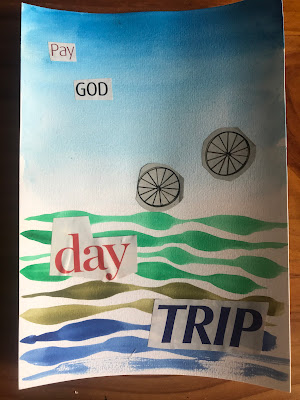
It’s been four-and-a-half months since I started making collage, it started with Esag and a vision board then we had another session where we made small, A5 collages on any theme though it began with a sky.

A sky.

How to make one with watercolour? I think you have to imagine when sitting in the room what a sky might look like if you’d been asked to design one. Once you have a sky you can put things under it, like mountains and rivers, spaceships and dogs.

Anything you like.

This is the first collage apart from the vision board that I made. Under the sky is a body of water, some bicycle wheels, and then there are the words, things that we partly take for granted – if they’re what we expect to see – and that challenge our understanding.


The second collage I made is below. In fact this painting also includes a sky but this time in violet instead of blue. The orange hill or mountain range at the bottom was deliberately added to give a sense of depth, but this sense of depth is challenged by the cut-outs in the sky that sort of give a view into an alternate universe where there are trees and some sort of galaxy.


Or cheese. 

Maybe it’s from a cooking magazine, in fact that’s it, I got it from a women’s magazine where on one page you have the universe of celebrity and on the next page you have the galaxy of skincare. Hyaluronic acid right with the royals!

A royal flush.

Skin care is not a big issue for men, though I understand that this is changing. Perhaps I should spend more time watching ‘Married at First Sight’ or ‘The Bachelor’. Instead I waste my evening hours with stupid 90s crime dramas, it seems like so many memorable ones were pioneered in that decade, on both sides of the Atlantic. Under the sky the ocean, but which ocean? A bicycle wheel means a machine, but one powered by humans. Today it’s raining tomorrow will be sun, true believers they march as one.

Saturday, 11 March 2023

New collage series

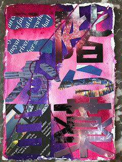
I wanted to get back to six-letter phrases and chose names to make the jump from what I was working on prior. I made two items in the new collage series, one dedicated to Jeffrey Dahmer (‘Dahmer mostro’) which is a subject I’d earlier tried in the initial collage series. I actually had the first one at the framers’ months ago but stopped the work because I wasn’t happy with it. I’m much happier with the new version.

Even though I’m much happier with the result the second time around I still worry that the underlying collage letters perhaps take up too much real estate. What do you think? If the letters were thinner would the result be better?

The second item in the new series is dedicated to Barry Manilow, a singer I was fond of when I was young.


To make the collage in each case I took pages out of ‘New Scientist’ magazine as I still have lots of this publication in reserve to use for collage.

Friday, 10 March 2023

'Death by cop' series

I took advice from a woman who sometimes comes to Eastern Suburbs Art Group gatherings and stopped putting collage on some of my works. This won’t mean that collage has been banished just that I’ll be more selective about where and when it appears. 

The new series ‘Death by cop’ is also figurative and comes from old photos taken in The Rocks one day. I enjoy the colours, the ways they meld and merge and stay separate, the ways that they create meaning just by sitting on the paper, or at least I hope they do. I enjoy making these things despite the title (which is, admittedly, a bit macabre) and there will be more to follow in the same vein.


I think that ‘Death by cop’ represents a new beginning, as for me this is the start of something that has space for experimentation. By this time I’ve started a number of series, including the ‘CAPitalism’ series and the ‘Kotowaza’ (Japanese sayings) series. Looking back to where all of this artmaking started I see in the placement of framed photos on shelves in my house, and in the hanging of pictures on the walls, an effort to bridge a divide. It’s hard to put it into words even though I’ve spent so many years writing in various ways, including poetry, journalism, and in my journal. If I try to pinpoint the significance of all of this artmaking I feel forced to stumble, just as, when I was a boy racing round a track, I felt the need to tap my toe on the ground – left and right, left, left and right, right – in order to keep the balance.

The balance?

Like I said it’s difficult to explain. I guess the reason why I started using collage is because of the years I spent making magazines and promotional brochures, newsletters and use manuals, reams and reams of “useful” literature that is probably now all pulped and recycled, or thrown into landfill. I remember and you’ll never know the careful effort that went into making those publications, the hours, minutes, weeks, months – scattered shards of time – now almost forgotten. Perhaps it’s in an effort to recycle that time that I now imagine worlds using collage.

The thing about collage is its rapidity, and this is allied to its potential for reuse. If I clip a piece of paper out of a magazine I can just quickly paste it down on top of the painting. The colours on the printed paper – if they remain unfaded – spark off in contrast with what lies on the paper. In the same way thoughts associated with current events or with my surroundings contrast with memories.

Wednesday, 8 March 2023

CAPitalism series revisited

I just can’t get enough … of the CAPitalism series, to which I’ve added four images. 


Unlike other series I think these ones work ok with collage. I don’t know exactly what it is and someone else might be better situated to comment on these artworks, but the collage in the CAPitalism (car, ad, pop music) seems to cohere with the images. 

What do you think?

In recent weeks I’ve had cars hanging on my living room walls because I reorganised the hang, I brought down from upstairs some paintings I bought 15 years back. I also put up some photos of Aunt Madge’s which I’d had framed.

On crime dramas cars have a special significance also, on Monday night I watched a particularly bizarre episode of ‘Chief Inspector Morse’ where his red Jaguar is vandalised with Masonic symbols. Morse is the suspect in a killing and another inspector is brought in to investigate the case. The attacker has a vendetta against Morse and scratches his car leaving it badly damaged. The replacement inspector is a Mason and at the end of the ep he invited Morse to join. It’s totally mad. Morse tracks the killer down to a house in Oxford and the murderer has plastered the walls with images of Morse in order to indicate in a televisual fashion that he’s obsessed with the detective. But the thing is that in this show the red car morse drives is almost like a character, when Morse and Lewis see the killer’s car in the driveway it turns out to be a Jaguar as well BUT A MORE MODERN MODEL and Morse disparagingly makes a comment so Lewis can hear. He mocks the style of the killer’s Jaguar as if the older style is MUCH BETTER when in fact (objectively speaking) you’d have to say a more modern car would be better in an engineering sense.

Then there’s Vera Stanhope’s Land Rover.

I did a four-panel painting in honour of ‘Vera’ where one panel features the car she drives, a boxy contraption square as the little hat she always wears around the traps. I did one panel for the hat as well. One for the hat and one for the car. The first and second panels are taken up with that aeroplane man statue they erected ‘Angel of the North’ or something I can’t remember I watched a YouTube video about it once. Engineering marvel. Pity the Japanese make better cars!

Tuesday, 7 March 2023

Bridge 9340

In a burst of creativity I completed these four paintings in one evening this week, the photos from my archives. In fact some of you might recognise the bridge over the Mississippi River in Minneapolis up in the headwaters that collapsed under the weight of traffic in August 2007.

The bridge was rebuilt within a year, so it, like the paintings, was fixed in a rush.

Where there’s a will there’s a way. I’m using so many old Japanese sayings that it is suitable to use an ancient (like me) English saying as well. 


Over the next few days I’ll be alone as houseguests are out of town so will be doing more painting. ‘Bridge 9340’ says “please do not panic” and I’ve got sentences lined up for the next two series, I’ll see if I feel like posting them when they’re finished, enough to say that they’ll be colourful like ‘Bridge 9340’.

When I think of Bridge 9340 I also think of those forgotten spaces in cities that we use to move from one place to another. Near the entrance to the M5 here in Sydney there’s an intersection that is similarly unlovely, with constant traffic despite the existence on the road of houses. The traffic is made worse by trucks that use the surface roads even though there’s a tunnel under the suburbs they could use if they could see a way to paying the fare. Some times I imagine what it must be to live on a road that is so heavily used, but most of the time I ignore it. When I’m in the intersection I am too busy trying to negotiate the traffic to spare a thought for the residents who have to put up with the incessant noise.

Monday, 6 March 2023

Zodiac series

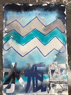
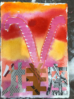
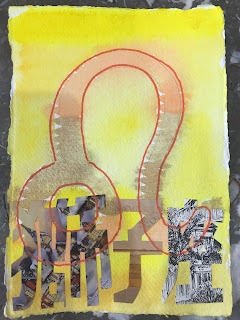
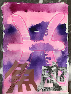
Over two days 4 and 5 Feb I made more than 12 paintings but these 12 sit in a series I made for my daughter, who is into horoscopes and everything to do with the zodiac. Because I love colours it was fun to make these. I was surprised by the thoughts that came to me when I was making them. I thought about culture, history, and the passage of time, I imagined what it might’ve been like to live at a time when horoscopes made up a larger part of life. I even though about the multiplicity of the star signs and how this inherent complexity requires learning, which is not easily given up once communally acquired. I thought about the Persian gods in the pantheon and how a multiplicity of influences accustoms us to compromise and reason. 
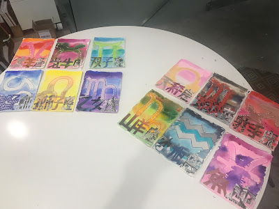
You can understand how satisfying it was to make these things.

I will get them framed in sets of six and I will send them to Japan so my family can do with them what they will. Using Messenger my daughter told me the colours to use for each star sign, and I interpreted these instructions myself. For the most part I used colours straight out of a tube but for Libra I had to devise a sort of creamy beige as well as a pink.


They look better close-up.


As with other paintings I made the first base layer with watercolour, let it dry, then put on collage. After this layer had set I added Posca marks to complete the image.
Saturday, 4 March 2023

Orange and green "kotowaza" paintings

I made “kotowaza” or “sayings” in pairs and had ‘Every move you make’ (see below) as a standalone and looking for a partner. I needed another orange and green painting so I asked my family in Japan again for their input and they came up with some options.

I was astonished at the rapidity with which my daughter rattled off sayings, she seems to have an unlimited supply within reach. ‘Don’t push your luck’ is below.

Now I have a pair in the same colour scheme I can go on to the next project, which might be the old ‘CAPitalism’ series or else something new I have planned. I will settle down to work soon.